Transforming a web design system for a new platforms is, unsurprisingly, an exercise in making tradeoffs: Deciding what makes sense to bring along ✅ and what doesn’t ⛔️.
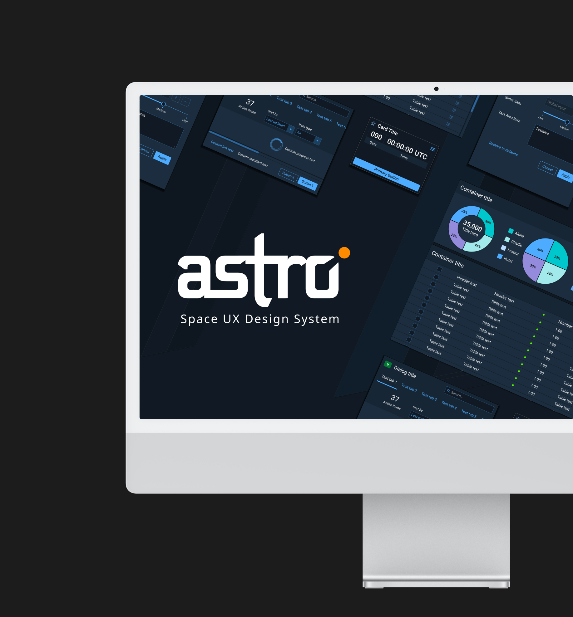
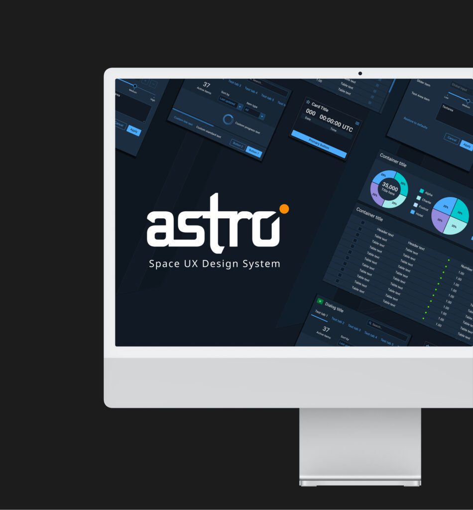
The Astro UX design system was created by Rocket Communications for the U.S. Space Force. Alongside Astro 7.0 for web, we’re pleased to offer Astro Platforms 2.0, native on all Apple operating systems. All good design system evolve around their users, so we’ve made the following improvements to Astro UXDS:
✅ Colors
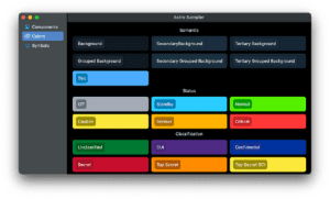
Astro UX has light and dark themes, but the signature dark blue theme is the most widely used. In our first attempt at Astro for iOS, our instinct was to apply the blue palette wherever possible, sometimes requiring uncomfortably tricky code. In Platforms 2.0, we found that a lighter touch yields better results. We’ve applied the blue shades sparingly to background components, and left iOS’ distinctive translucent bars and overlays alone, preserving its lightness and layering.
We were also more careful about matching the iOS color model, mirroring the native semantic colors with our own. For macOS, tvOS, and watchOS, we’ve tried to find a balance between each platform’s unique color model and the unified color capabilities of Apple’s SwiftUI framework. For example, on watchOS we substitute pure black for the background color, as recommended in the design guidelines.
⛔️ Fonts
In contrast to Astro’s signature color theme, Astro’s web font is less fundamental to its identity. The font has changed over the years, always intended to be familiar and platform-appropriate. Apple’s system fonts have superpowers that web fonts can’t match, and provide a welcome consistency. We chose to use the native SF font family for Platforms 2.0.
✅ Icons
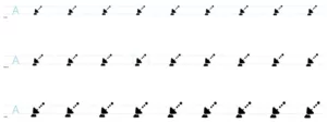
Apple’s flexible new icon format, SF Symbols, offers multi-size and multi-weight icons that match the look and capabilities of the SF fonts. For Platforms 2.0, we transformed Astro’s space-themed icons from simple vectors into full SF Symbols. Supporting dynamic fonts and icons allow Astro apps to respond to users’ accessibility settings and display preferences.
⛔️ System Components
Astro 7.0 provides a complete set of web UI components. But each of Apple’s platforms has its own familiar UI components, tuned for its interaction model. We chose not to replace any system components, only tinting them with Astro’s accent color.
✅ Space Components
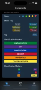
Astro is no ordinary design system. It was created to build apps for space operations. Astro 7.0 has many bespoke components to support these apps, such as status symbols, classification markers, mission clocks, and more. Additionally, Platforms 2.0 includes many of these space components, re-written for SwiftUI, with more to come.
⛔️ Technology
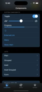
Astro’s Platform is written in Swift for SwiftUI, and inherits no web technologies. We want our developers to have the right tools on every platform. Astro Swift Foundation, a Swift package (source), brings Astro to the Apple environments. The Astro Sampler (App Store, source) lets developers explore components, symbols, and colors. Astro Launches (App Store, source) demonstrates integrating Astro into a full-featured SwiftUI app.


